 25 Jul 26
The 12 brand archetypes, what each one means, real Indian and international examples, and a working method for choosing yours and implementing it across voice, visuals, and experience. Written for founders and marketers who want a brand with a spine.
Most brands do not have a personality problem. They have a personality vacuum. They are competent, they are clear about what they sell, and they are completely forgettable, because nothing about the way they show up tells you who they are. Brand archetypes are the fix for that. They are one of the oldest, most useful tools we reach for at Identiti when a brand feels generic, and this is the guide we wish more founders had read before they briefed their first logo.
An archetype is not a logo, a colour palette, or a tagline. It is a decision about character. It answers a question that sits underneath every other branding decision: who is this brand, as a person, and what does it fundamentally want. Get that right and everything downstream, the voice, the visuals, the campaigns, the product choices, gets easier and more consistent. Get it wrong, or skip it entirely, and you end up with a brand that borrows a bit of everyone and belongs to no one.
This is a long, deliberately detailed guide. We will cover where archetypes come from and why they work on the human brain, walk through all 12 with real examples, group them into four families so they are easier to hold in your head, and then get practical about how to choose yours and implement it across the whole brand. Read it end to end and you should be able to run the exercise for your own brand.
The idea
Where brand archetypes come from
The concept traces back to the psychiatrist Carl Jung, who argued that human beings share a set of universal, inherited patterns he called archetypes. These are recurring characters and symbols, the Hero, the Wise Old Man, the Mother, the Trickster, that show up across cultures, myths, and stories precisely because they map onto something deep and shared in how we make sense of the world. Jung called the reservoir these patterns live in the collective unconscious. You do not have to learn what a Hero is. You already recognise one.
In 2001, Margaret Mark and Carol Pearson took that idea and pointed it at branding in a book called The Hero and the Outlaw. Their argument was simple and powerful: the strongest brands behave like archetypal characters, and when a brand consistently expresses a single, recognisable archetype, it taps into meaning that consumers already carry. The brand stops being a vendor and starts being a character in the customer’s own story. They distilled the landscape into 12 archetypes, and that framework is the one most of the industry, including us, still uses today.
The reason it endured is that it is not decoration. It is a strategy tool disguised as a storytelling one. It gives a brand a stable centre of gravity, so that a thousand small decisions made by a hundred different people over several years still add up to one coherent thing.
Why archetypes actually work
It helps to understand the mechanism, because it changes how seriously you take the exercise.
The first reason is cognitive economy. People do not have the time or attention to deeply evaluate every brand they meet. Archetypes let a brand communicate a whole personality instantly, using patterns the audience already understands. When a motorcycle brand shows up rebellious and unpolished, you do not need a paragraph of explanation. You feel the Outlaw in a single frame.
The second reason is emotional resonance. Every archetype is built on a core human desire: to belong, to be free, to be safe, to master something, to be admired, to be transformed. Brands that anchor to an archetype are, in effect, aligning themselves with a motivation the customer already has. That is why archetypal brands create feeling and not just recognition. They are speaking to something the person wants before they ever encountered the brand.
The third reason is consistency, which is the quiet superpower here. A brand is not built in one campaign. It is built by thousands of touches, an ad, a packaging decision, a support email, a booth at an event, a founder’s LinkedIn post. Without a shared character, each of those gets made in its own little vacuum and the brand drifts. An archetype is the reference point that keeps them aligned, which is exactly the discipline we wrote about in keeping a brand consistent when you are producing at volume. The archetype is what “on brand” actually means when you try to define it.
The four families
Twelve is a lot to hold in your head, so it helps to know that the 12 archetypes cluster into four families, grouped by the core human motivation each one serves. When you are choosing an archetype, it is often easier to first decide which family your brand belongs to, then pick the specific character inside it.
The first family is the pursuit of paradise, driven by the desire for happiness and inner fulfilment: the Innocent, the Explorer, and the Sage. These brands help people feel good, discover, or understand.
The second family is leaving a mark on the world, driven by the desire for mastery and to change things: the Hero, the Outlaw, and the Magician. These brands are about achievement, disruption, and transformation.
The third family is connection and belonging, driven by the desire for intimacy and togetherness: the Everyman, the Lover, and the Jester. These brands bring people closer, to each other or to pleasure and fun.
The fourth family is providing structure and control, driven by the desire for stability and order: the Caregiver, the Ruler, and the Creator. These brands protect, lead, or build.
You will notice most categories skew toward a family. Luxury lives in the structure family. Adventure gear lives in the paradise family. That is useful information, because it tells you both what is expected in your category and where the open space might be.
The 12 brand archetypes
Here is each archetype in detail: what it is, the human desire it taps, an Indian and an international example, and a quick note on how it tends to show up in identity and voice. A note on the examples, since it matters for accuracy: a few brands commonly passed around in archetype lists are labelled as Indian when they are not, so the Indian examples below are all genuinely Indian brands, and the international ones are chosen for how cleanly they express the character.
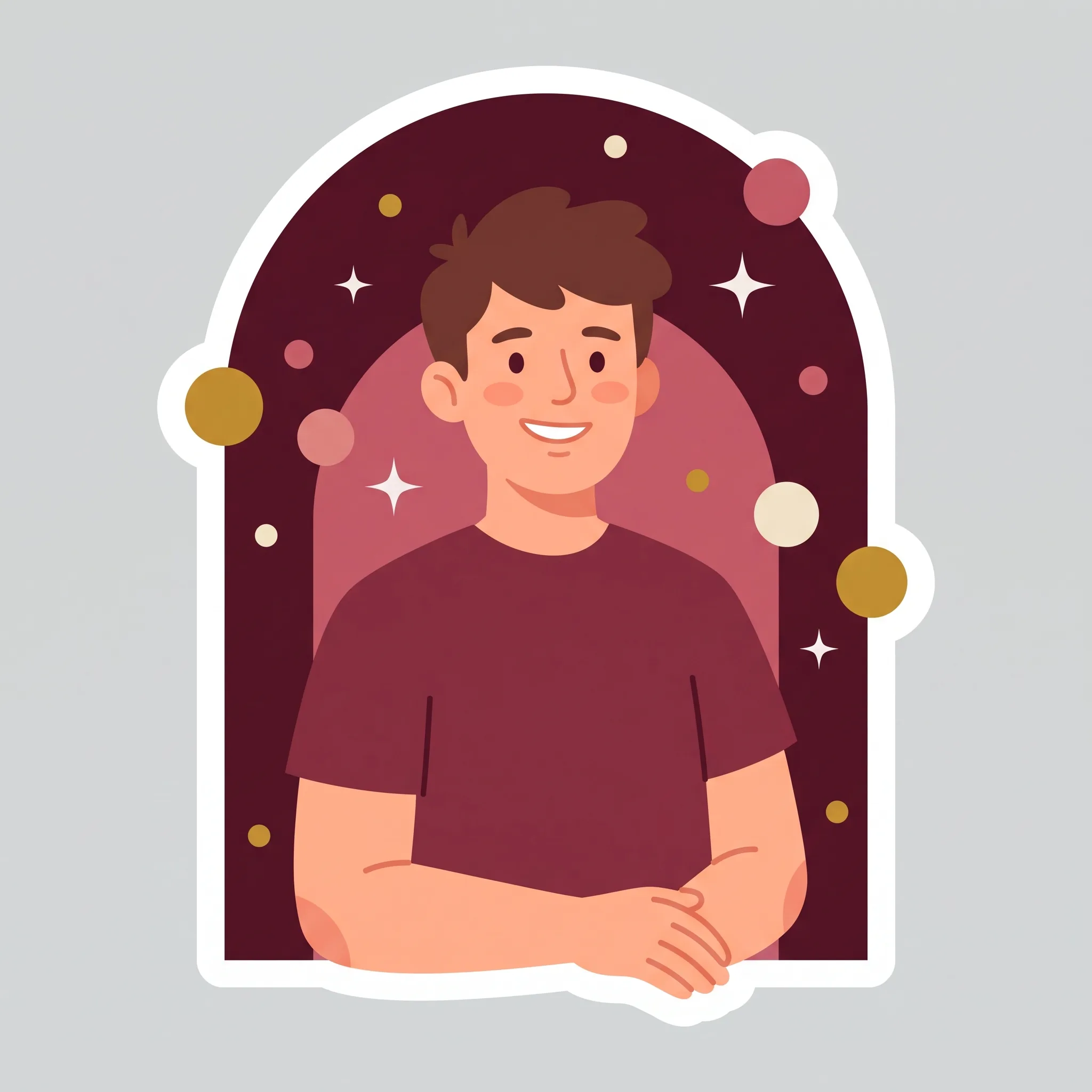
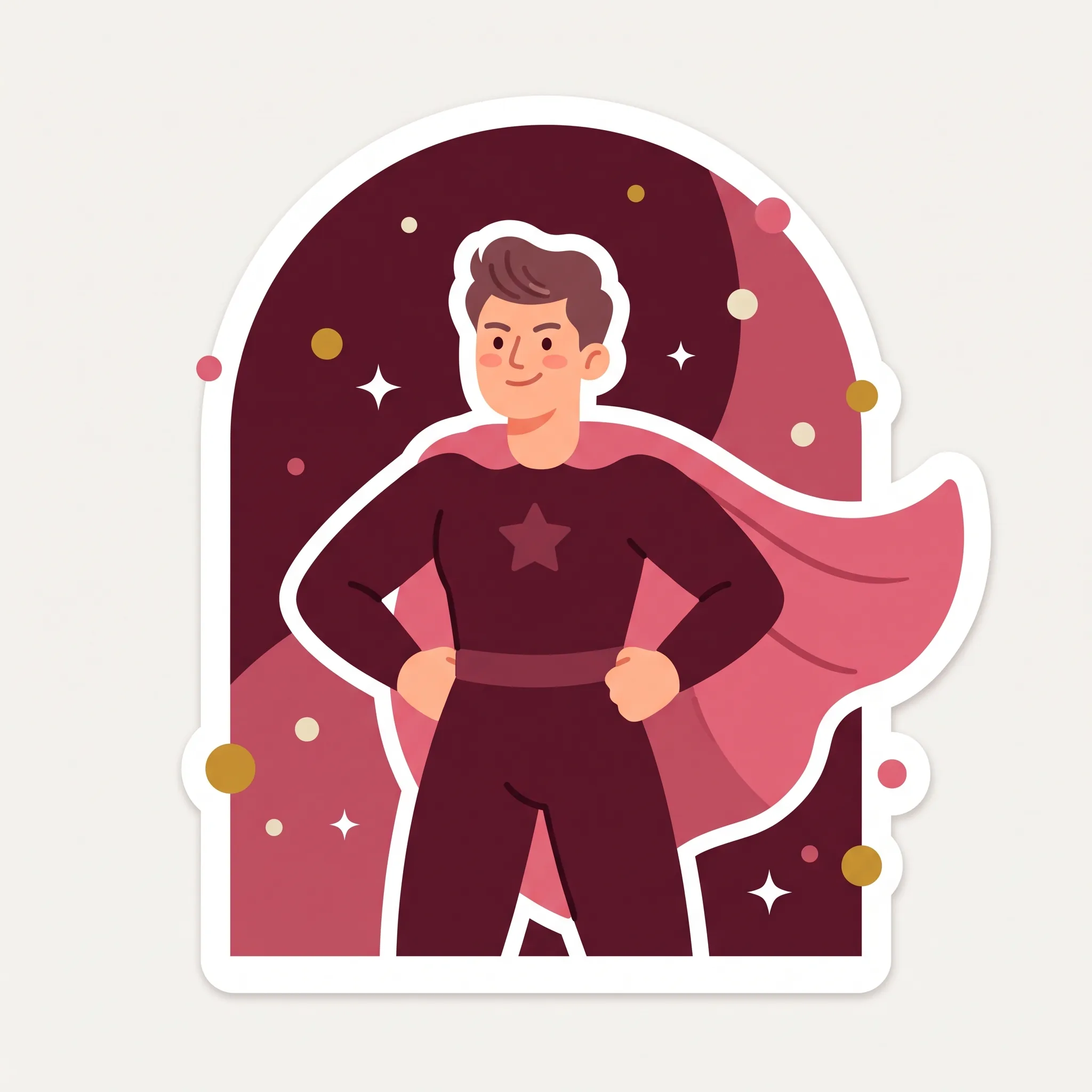
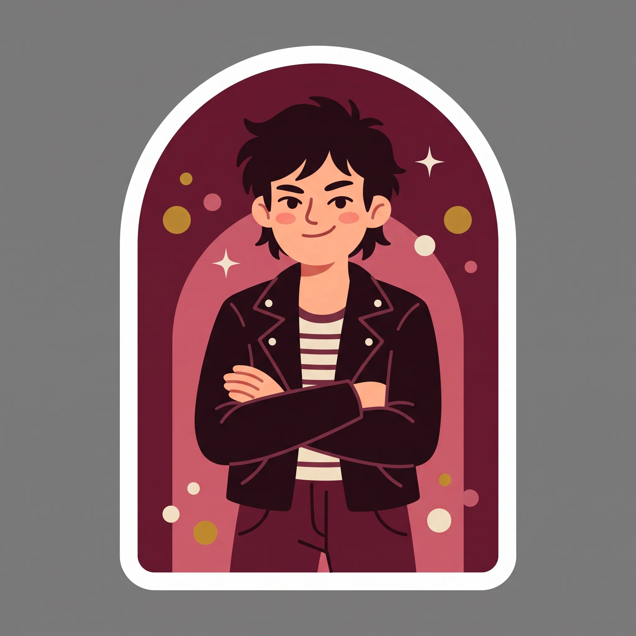
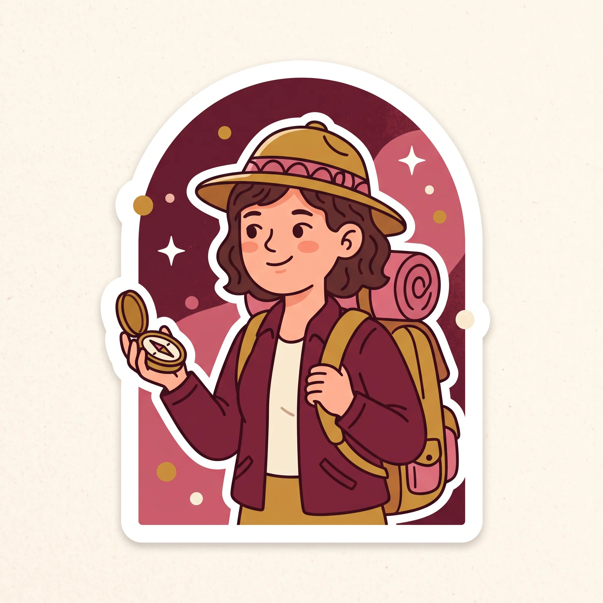
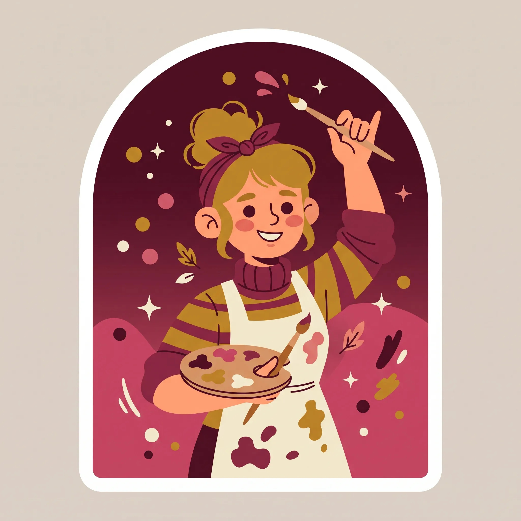
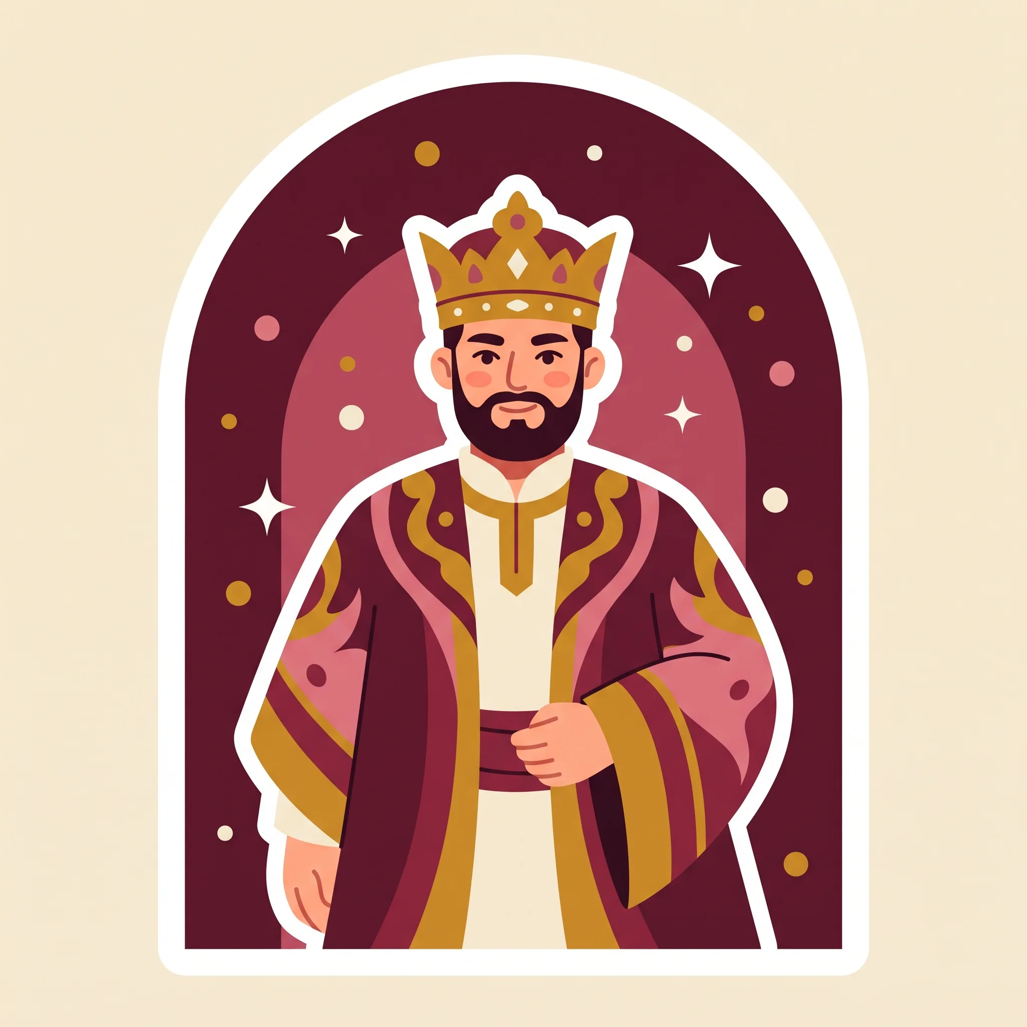
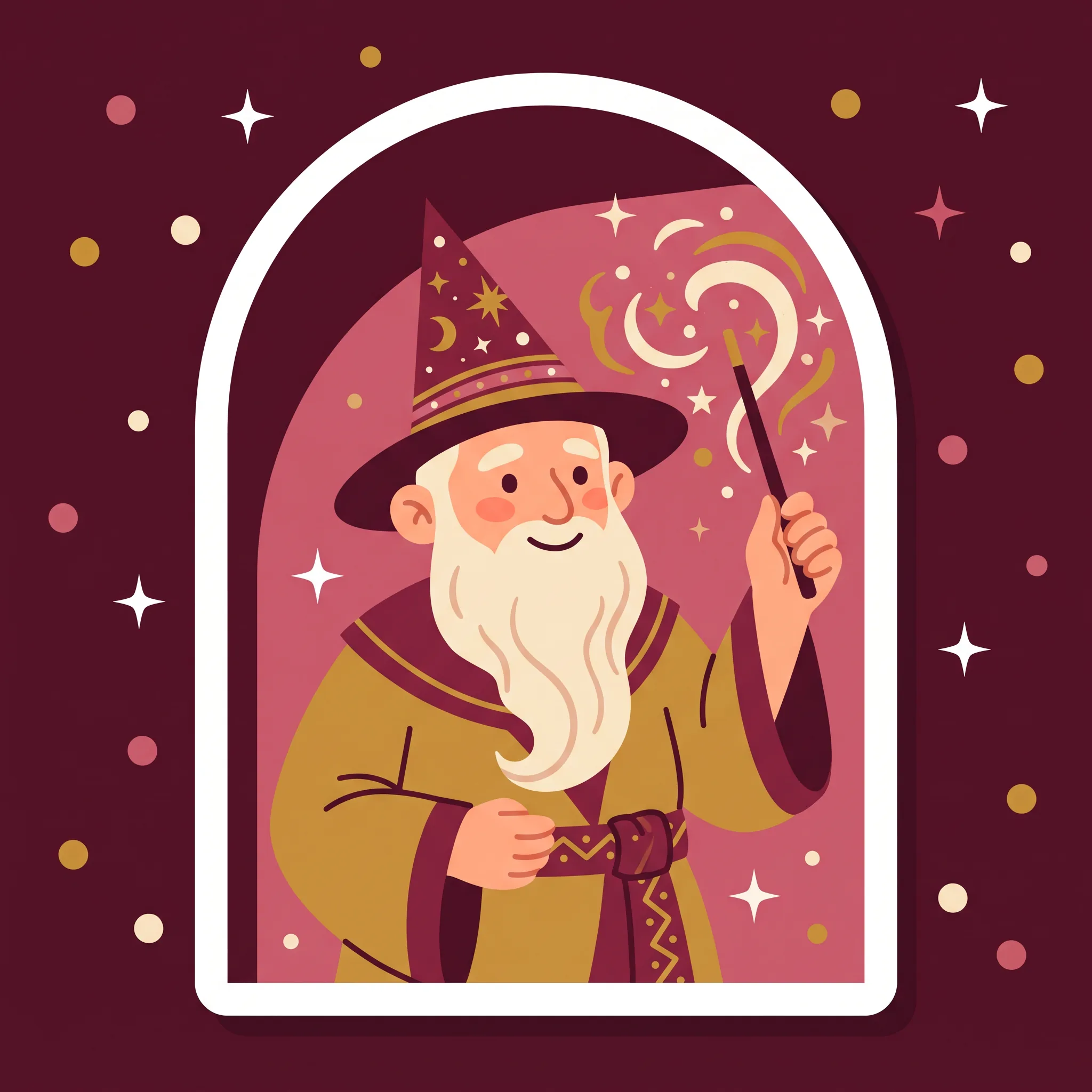
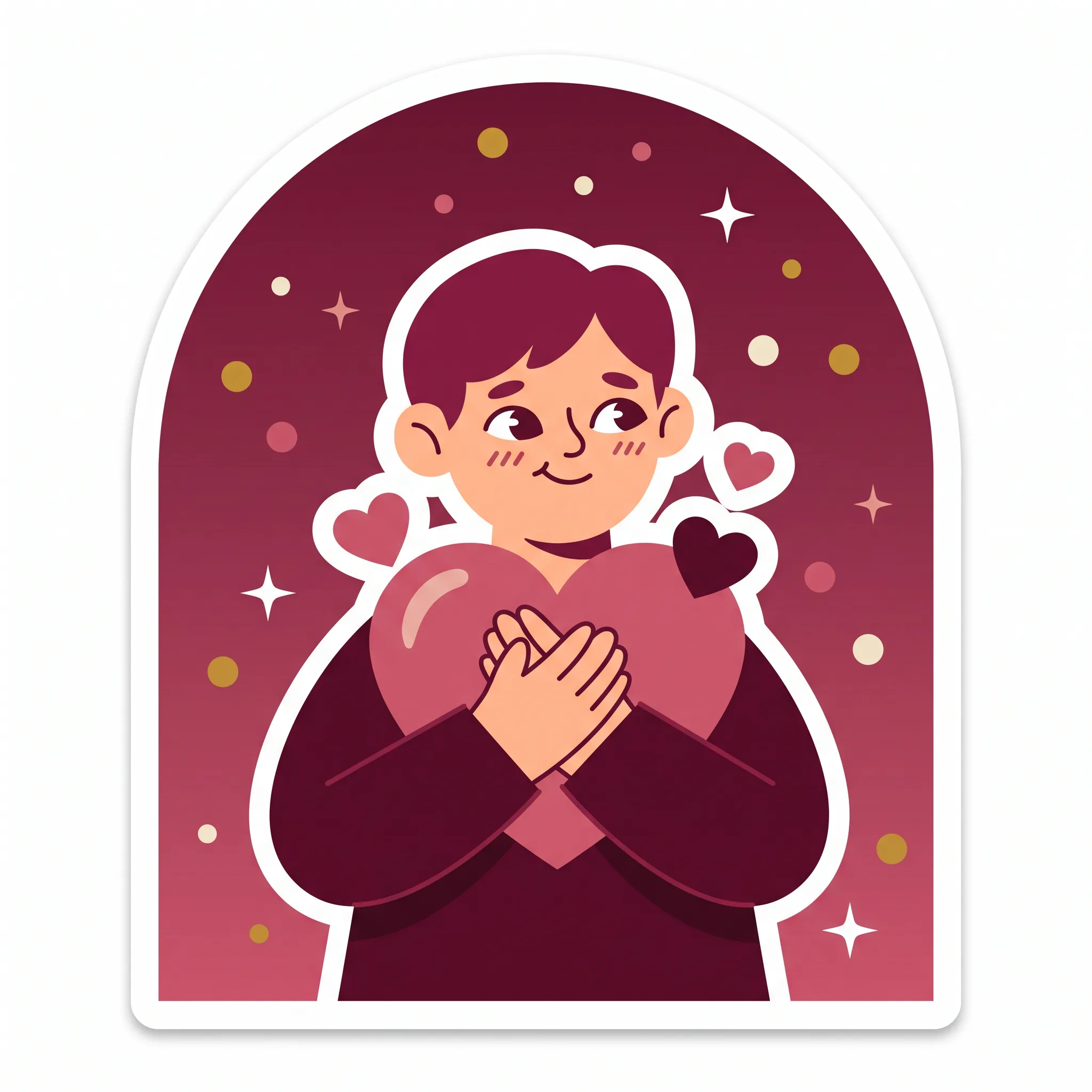
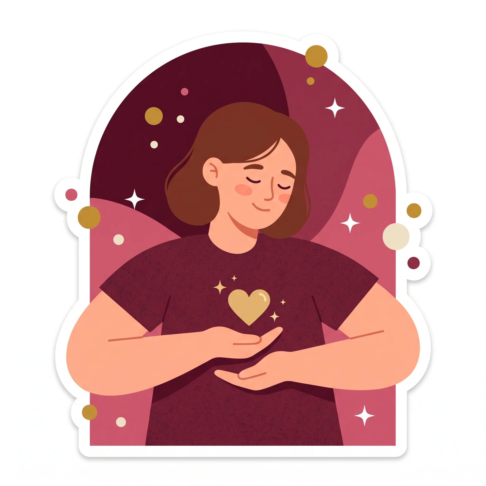
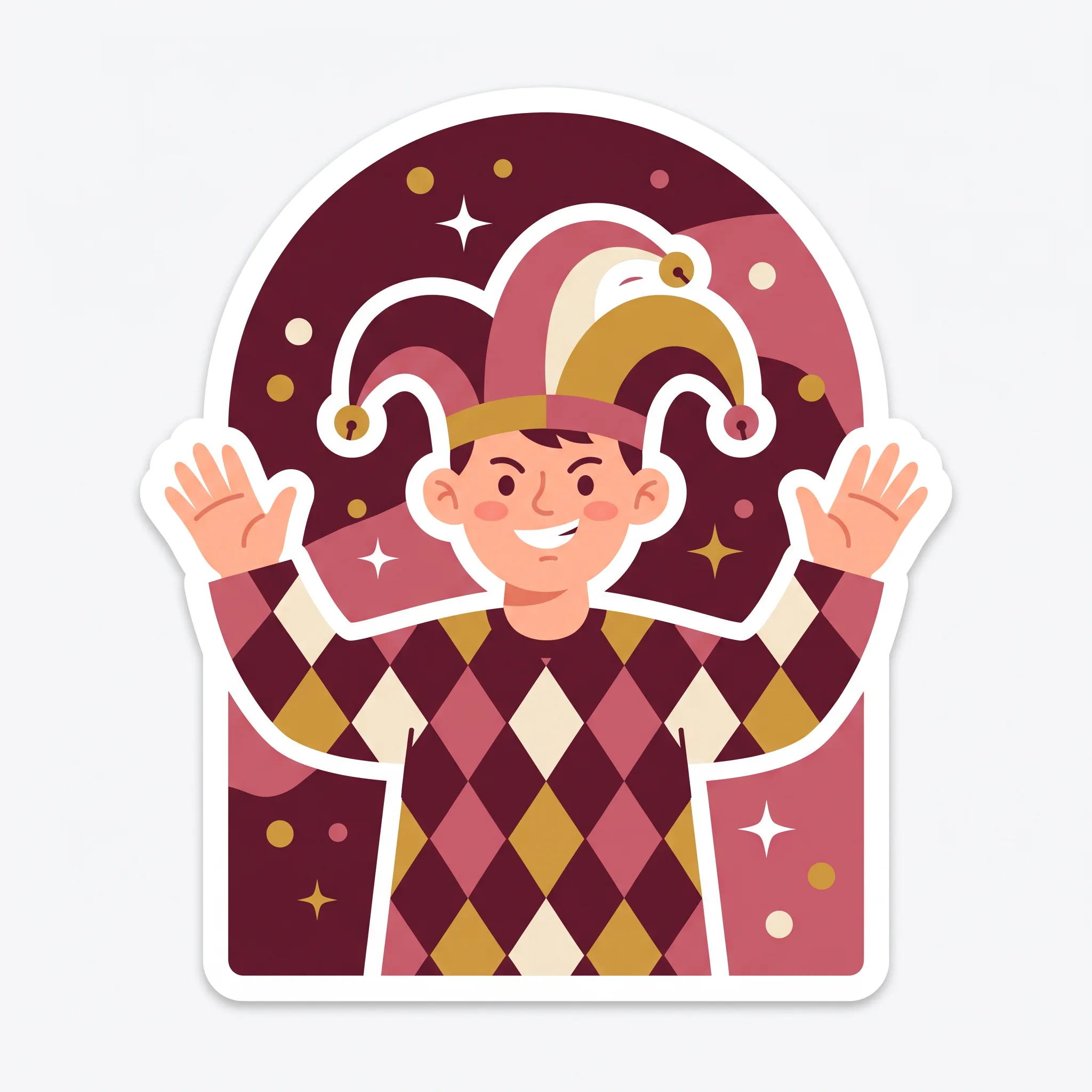
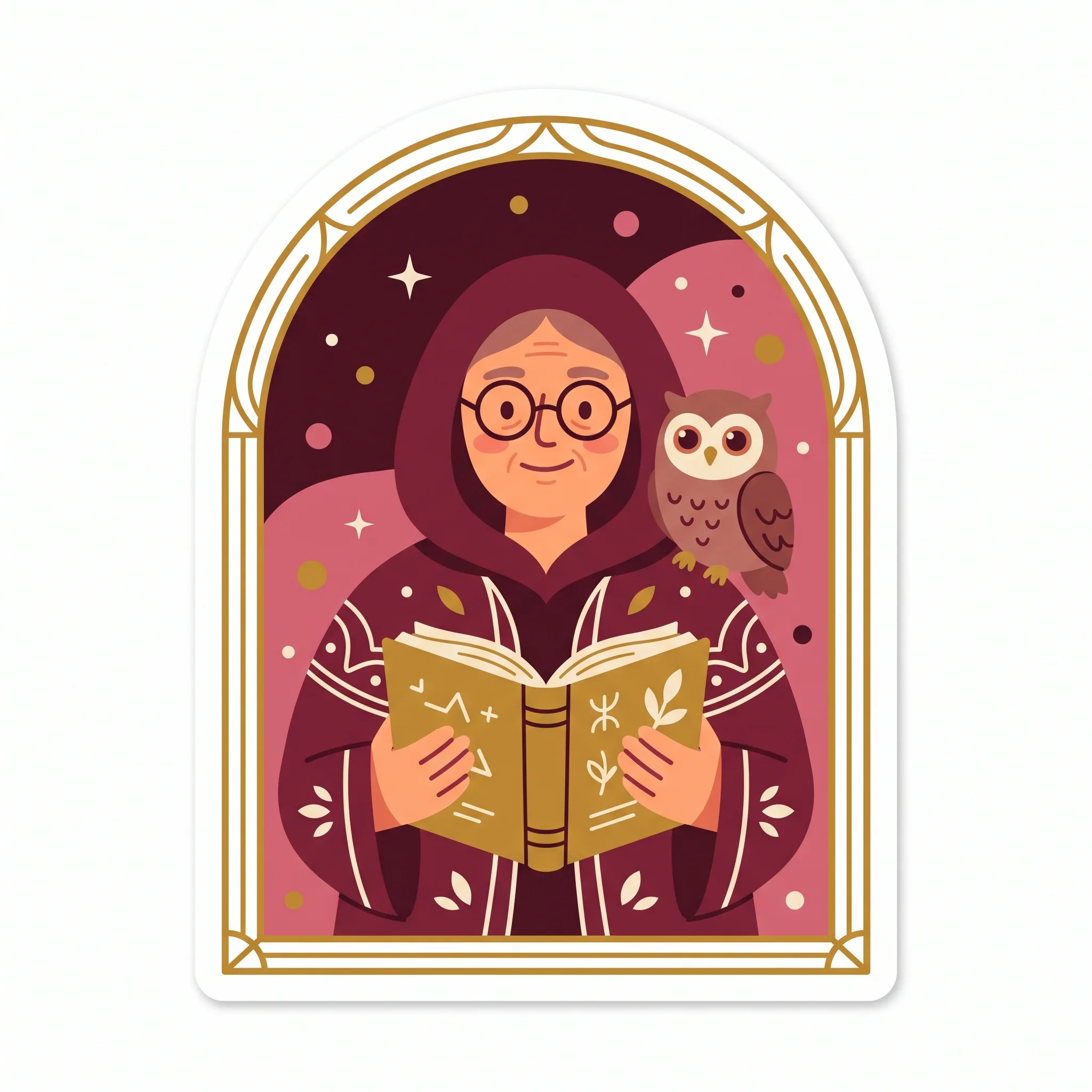
At a glance, here are all twelve.

✅ 1. The Innocent
The Innocent embodies purity, simplicity, and optimism. It appeals to our desire for happiness, goodness, and a sense that things can be simple and clean. Innocent brands avoid cynicism and complexity. They promise that life, or at least this small part of it, can be uncomplicated and good.
Indian example: Parle-G, the biscuit that is wholesome, nostalgic, and utterly unpretentious, a small everyday goodness millions grew up on. International example: Dove, with its purity and real-beauty positioning that rejects manufactured perfection.
In identity terms the Innocent leans clean, bright, and warm, with plain language, soft palettes, and imagery that feels honest rather than staged. The risk to manage is naivety: an Innocent brand must feel simple, not simplistic.
✅ 2. The Everyman
The Everyman represents the ordinary person: relatable, down to earth, and free of pretension. It resonates with our desire to belong and to be accepted as we are. Everyman brands are the opposite of exclusive. They signal that you do not need to be special to be welcome here.
Indian example: Amul, the utterly-everyday dairy brand woven into ordinary Indian kitchens for decades. International example: Levi’s, the honest, hard-wearing denim that has always dressed everyone rather than an elite.
The Everyman voice is friendly, plain-spoken, and a little self-deprecating. Visuals feel real and unpolished on purpose. The risk is blandness, so an Everyman brand needs warmth and wit to avoid disappearing into the wallpaper.
✅ 3. The Hero
The Hero is bold, courageous, and focused on achievement. It appeals to our desire for success, strength, and the satisfaction of overcoming a hard obstacle. Hero brands are about rising to the challenge and proving what is possible through effort and will.
Indian example: Tata, long associated with resilience, nation-building, and doing hard things well. International example: Nike, the definitive Hero brand, built entirely on triumph, discipline, and the athlete inside everyone.
Hero identity is strong, confident, and energetic, with decisive language and imagery of effort and victory. The shadow to watch is arrogance: the Hero inspires when it champions the customer, and grates when it only celebrates itself.
✅ 4. The Outlaw
The Outlaw is rebellious, unconventional, and built to challenge the status quo. It appeals to our desire for freedom, independence, and the thrill of breaking free from rules that no longer serve us. Outlaw brands do not want to fit in. They want to overturn.
Indian example: Royal Enfield, a machine and a subculture built on freedom, grit, and going your own way. International example: Harley-Davidson, the archetypal rebel brand whose customers tattoo the logo on their bodies.
Outlaw identity is raw, bold, and often deliberately rough, with defiant language and imagery that rejects polish. The risk is that rebellion can tip into alienation, so the Outlaw has to stand for something, not just against everything.
✅ 5. The Explorer
The Explorer is about adventure, curiosity, and the thirst for discovery. It resonates with our desire for new experiences, freedom, and personal growth through the journey rather than the destination. Explorer brands invite you to go further and find out what is out there.
Indian example: Mahindra Thar, an open invitation to the road less travelled and the terrain most vehicles avoid. International example: Jeep, whose entire identity is built on getting off the map.
Explorer identity favours wide-open imagery, movement, and language about journeys, frontiers, and the unknown. The risk is restlessness with no anchor, so the Explorer needs a clear sense of what the discovery is for.
✅ 6. The Creator
The Creator is imaginative, innovative, and driven by self-expression. It appeals to our desire for originality, craft, and leaving something of lasting value behind. Creator brands give people the tools and the permission to make things, and they treat imagination as the highest value.
Indian example: Zoho, the software company built on a maker’s ethos, building its own tools its own way rather than following the herd. International example: Apple, which has spent decades positioning itself as the brand for people who create.
Creator identity is designed to a high standard, expressive, and often tool-focused, with language about building, making, and craft. The risk is self-indulgence: the Creator has to help the customer create, not just show off its own cleverness.
✅ 7. The Ruler
The Ruler is powerful, authoritative, and focused on control and order. It appeals to our desire for leadership, status, success, and being taken seriously. Ruler brands promise that they are the standard, the safe premium choice, the one in charge of the category.
Indian example: Taj Hotels, which commands the top of Indian hospitality with an assured, in-control sense of occasion. International example: Rolex, a brand that has made itself synonymous with achievement and authority.
Ruler identity is refined, premium, and controlled, with confident, restrained language and imagery of quality and status. The shadow is coldness or snobbery, so the best Ruler brands lead with excellence rather than exclusion.
✅ 8. The Magician
The Magician is visionary, transformative, and driven by the desire to make dreams real. It resonates with our appetite for change, wonder, and the sense that the impossible can happen. Magician brands promise transformation: give us your problem, your dream, your raw material, and we will turn it into something extraordinary.
Indian example: ISRO, which turns audacious visions into reality on a shoestring and fills a nation with genuine wonder. International example: Disney, the definitive Magician, an entire empire built on making magic feel real.
Magician identity is aspirational and slightly mysterious, with language about transformation, vision, and possibility. The risk is over-promising, so the Magician has to deliver enough real wonder to back the claim.
✅ 9. The Lover
The Lover is passionate, sensory, and focused on intimacy, beauty, and deep connection. It appeals to our desire for closeness, romance, and to feel special and desired. Lover brands are about relationships and pleasure, and they make the customer feel seen and cherished.
Indian example: Tanishq, whose advertising has, for years, been built around love, relationships, and the emotional weight of the moments people mark with it. International example: Victoria’s Secret, a brand built squarely on desirability and intimacy.
Lover identity is sensory and beautiful, with rich imagery, warm intimacy, and language about connection and feeling. The risk is superficiality, so the Lover has to offer real emotional depth and not only surface glamour.
✅ 10. The Caregiver
The Caregiver is nurturing, compassionate, and driven by service to others. It resonates with our desire for protection, support, and the reassurance that someone is looking after us. Caregiver brands lead with empathy. Their promise is that they will take care of you or help you take care of others.
Indian example: Dabur, whose long heritage in health and natural wellness is fundamentally about caring for the body and the family. International example: TOMS, built on a giving model that turns every purchase into an act of care.
Caregiver identity is warm, gentle, and reassuring, with soft palettes and language about protection, health, and support. The risk is being seen as soft or self-sacrificing to the point of weakness, so the Caregiver benefits from quiet competence alongside the warmth.
✅ 11. The Jester
The Jester is playful, humorous, and focused on enjoyment and living in the moment. It appeals to our desire for fun, laughter, and a break from the seriousness of everything else. Jester brands do not take themselves too seriously, and they give the audience permission to lighten up.
Indian example: Zomato, famous for witty, irreverent notifications and marketing that made a food-delivery app genuinely fun to hear from. International example: Old Spice, whose absurdist humour rebuilt an ageing brand for a new generation.
Jester identity is bright, quick, and irreverent, with clever, funny language and a willingness to be silly. The risk is being seen as unserious when it matters, so the Jester has to know when to drop the act.
✅ 12. The Sage
The Sage is wise, thoughtful, and focused on truth and understanding. It resonates with our desire for knowledge, clarity, and the confidence that comes from genuinely understanding something. Sage brands are teachers and truth-tellers. Their promise is that they will help you see clearly and decide well.
Indian example: Zerodha, an education-first brand that won trust by teaching people to understand investing rather than hyping it. International example: Harvard University, a global shorthand for knowledge and intellectual authority.
Sage identity is clear, credible, and uncluttered, with calm, precise language and a strong bias toward evidence. The risk is being dry or preachy, so the Sage has to teach generously rather than lecture.
How to choose your archetype
This is where most of the value is, and where most brands rush. Choosing an archetype is not picking your favourite character. It is diagnosing who your brand truly is and who your audience needs it to be. Here is the method we use.
Start from truth, not aspiration. The single most common mistake is choosing the archetype you wish you were rather than the one you actually are. A careful, evidence-driven accounting firm is not going to become an Outlaw because Outlaws look cool. Look honestly at how you already behave: how you make decisions, what you are proud of, how your best customers describe you, what your founders actually care about. The right archetype is usually already there in the truth of the business, waiting to be named.
Define your core values and personality. Before you reach for a character, get specific about what the brand believes, how it wants to make people feel, and the traits that are genuinely yours. If the words that keep coming up are trust, calm, and clarity, you are almost certainly in Sage or Caregiver territory. If they are boldness, freedom, and defiance, you are near the Outlaw or Hero. The values point at the archetype, not the other way around.
Find the emotional job. Ask what your customer is really hiring you to feel. People do not buy a motorcycle for transport, they buy freedom. They do not buy skincare, they buy the feeling of being cared for or admired. Identify the core desire your product serves emotionally, and match it to the archetype built on that desire. This is where the four families are handy: decide which fundamental human motivation you serve, then narrow to the specific character.
Pressure-test against your audience and category. The right archetype has to resonate with the people you serve and give you room to stand apart. Map the archetypes your main competitors occupy. If every brand in your category is a Ruler, there may be an opening to be the Everyman or the Jester who makes the category human. Distinctiveness, which we have argued is the whole point of branding elsewhere, including in how you get recognised even by AI assistants, often comes from picking the character your category has ignored.
Pick a primary, and optionally a secondary. Strong brands usually lead with one dominant archetype, but many carry a secondary influence that adds texture. Nike is a Hero with a streak of Outlaw. Apple is a Creator with a touch of Magician and, at times, Outlaw. Choose one primary archetype to govern the brand, and at most one secondary to add nuance. Two is a flavour. Three or more is a personality disorder, and the brand loses its centre.
Write it down as a decision. The output of this exercise should be a short, sharp statement the whole team can hold: our brand is the [archetype], because we exist to [core desire we serve], and we express that by [two or three concrete behaviours]. That sentence becomes the reference every future decision is checked against.
How to implement it across the brand
Choosing the archetype is the strategy. Implementation is where it becomes a brand people actually experience. The principle is simple and demanding: the archetype has to be visible, consistently, at every touchpoint. Here is where it shows up.
Voice and tone come first, because they are the fastest signal of character. A Jester and a Sage would describe the identical product in completely different words, and the audience would feel the difference immediately. Define, in writing, how your archetype speaks: its vocabulary, its rhythm, what it would never say. A Ruler does not use slang. An Everyman does not use jargon. Give writers concrete guardrails, not vague adjectives.
Visual identity has to carry the same character. The logo, typography, colour, photography style, and layout should all express the archetype before a single word is read. An Innocent brand in a dark, aggressive palette is fighting itself. When you produce creative at scale, especially with AI in the mix, the archetype is the brief that keeps everything recognisably yours, which is exactly the discipline behind choosing brand-safe AI image tools and using them well. The tools change. The character they serve should not.
Messaging and campaigns are where the archetype does its most visible work, and where consistency matters most. The story you tell, the emotions you reach for, and the promises you make should all flow from the same character. That includes making sure the message stays consistent as the customer moves from one touchpoint to the next, the exact problem we dug into in matching your ad to your landing page. A Hero ad that lands on a timid, apologetic page breaks the character and the conversion at the same time.
Product and service decisions should reflect the archetype too, because customers judge character by behaviour more than by claims. A Caregiver brand that makes returns painful is lying about who it is. A Sage brand that hides information behind a sales call is contradicting itself. The archetype should shape what you build, what you make easy, and what you refuse to do.
Customer experience and support are the moments of truth. It is easy to be on-brand in a polished campaign and off-brand the moment a customer has a problem. The archetype has to survive contact with a late delivery, a bug, a refund request. That is where people find out whether the character is real.
Internal culture and employees are the foundation under all of it. Your team delivers the brand every day, so they need to understand the archetype as clearly as your designers do. When people know the brand is, say, the Caregiver, a hundred small daily judgement calls line up automatically. The archetype becomes a shared instinct, not a document nobody reads.
Applications and benefits
When an archetype is chosen well and implemented consistently, the payoffs compound.
It creates differentiation. In a crowded category where everyone lists the same features, a distinct character is often the only thing that makes a brand memorable. The archetype gives you a personality no spec sheet can copy.
It builds emotional connection. Because archetypes are built on universal human desires, they let a brand connect on the level of feeling and identity, not just utility. Customers do not just use the brand, they relate to it.
It drives loyalty and advocacy. Emotional connection is what turns a customer into a fan. People stay with, and speak up for, brands whose character they have adopted as part of their own identity, which is why Outlaw and Hero brands inspire the fiercest communities.
It makes messaging consistent. The archetype is a shared framework that keeps communication aligned across every channel and every team, so the brand adds up to one thing over years rather than fragmenting.
It guides product and service development. A clear character is a filter for what to build and how to build it, keeping new offerings aligned with the brand rather than pulling it in every direction the market suggests.
It engages employees. A well-understood archetype gives the whole organisation a shared sense of who the brand is, which improves everything from hiring to support to the tone of an out-of-office reply.
Common mistakes to avoid
We see the same errors often enough that they are worth naming plainly.
The costume mistake is treating the archetype as a coat of paint applied to the marketing, while the actual business behaves like something else. Customers feel the gap immediately, and the mismatch reads as inauthenticity. The archetype has to be lived, not worn.
The aspiration mistake is choosing the archetype you admire instead of the one that is true. It produces a brand that never quite convinces, because the team cannot deliver a character they do not have.
The committee mistake is trying to be several archetypes at once so that nobody is left out. The result is a brand with no centre, which is the exact problem archetypes exist to solve. Pick one primary. Be brave about it.
The imitation mistake is copying the category leader’s archetype because it is working for them. All that does is make you the weaker version of someone else. The opportunity is almost always the character your category has neglected.
The one-and-done mistake is treating the archetype as a logo decision that ends when the brand guidelines are delivered. An archetype is a living commitment that has to be monitored, protected, and occasionally evolved as the brand and its audience change. Watch how people actually perceive you, and refine the expression over time while keeping the core character stable.
The payoff
Brand archetypes are not a personality quiz for your logo. They are a strategic decision about who your brand is, grounded in patterns that are already wired into how humans understand each other. Choose the right one, honestly and from the truth of your business, and you get a brand with a spine: one that is easier to design for, easier to write for, easier for your team to deliver, and far harder for the market to forget. Choose none, and you get what most brands get, which is competence without character and a place in nobody’s memory.
The work is in the choosing and the discipline of the consistency, not in the framework itself. But it is some of the highest-leverage brand work you can do, because it makes every other decision downstream a little clearer and a lot more coherent.
If you want help finding the archetype that is genuinely true to your brand and building an identity that expresses it across everything you make, that is exactly the kind of work we love.